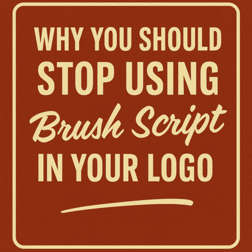
At some point in the 1990s, Brush Script seemed to be everywhere—from hair salons to auto body shops. Its swooping, handwritten style was meant to feel approachable and personal. But times have changed, and if you’re still using Brush Script in your logo today, it might be time to rethink your design choices.
Here’s why:
1. It’s Overused and Outdated
Brush Script was designed in 1942, and its peak popularity came and went decades ago. Because it was included in early versions of Windows and Microsoft Office, it quickly became one of the most overused fonts in existence. Now, when people see Brush Script, they don’t think “vintage charm”—they think “cheap and generic.”
In the world of branding, perception is everything. A dated font can make your entire business look behind the times, regardless of how modern your products or services may be.
2. It’s Hard to Read
One of the biggest sins in logo design is poor legibility. Brush Script’s slanted, connected letters might look fine at large sizes, but shrink it down to fit on a business card or an embroidered hat, and the swashes and curls turn into a jumbled mess. If people can’t read your business name at a glance, you’re missing the mark.
3. It Lacks Professionalism
Brush Script was intended to mimic casual handwriting, but in branding, casual doesn’t always mean trustworthy. Whether you’re a law firm, a tech company, or even a bakery, your logo needs to inspire confidence. Brush Script often gives off a DIY or amateur vibe—not ideal when you’re trying to build a professional presence.
4. It Doesn’t Scale Well Across Media
A good logo needs to work on a billboard, a website, a T-shirt, a pen, and a phone screen. Brush Script, with its delicate strokes and inconsistent line weight, doesn’t hold up well across different media. You’ll find yourself fighting with it every time you scale, embroider, or screen print.
5. There Are Better Alternatives
Want a script font that feels friendly or handcrafted? There are hundreds of modern options with better balance, cleaner letterforms, and more versatility. Fonts like Pacifico, Lobster, or Sign Painter offer style without sacrificing function. Or better yet, work with a designer to create a custom script logo that’s truly unique to your brand.
Final Thoughts
Your logo is often the first impression someone has of your business—don’t let Brush Script drag it down. Retiring outdated fonts is a simple but powerful step toward modernizing your brand and standing out in a competitive market.
Design evolves. So should your logo.